How to Interpret Results
This tutorial explains how to read and interpret the outputs generated by scGHSOM, including clustering metrics, hierarchical structures, and visualization maps.
Overview
scGHSOM is an unsupervised single-cell clustering algorithm designed to address the limitation of conventional clustering methods in capturing clusters-within-clusters structures. By adopting a hierarchical clustering framework, scGHSOM enables multi-resolution exploration of cellular populations and facilitates the interpretation of cellular heterogeneity at different levels of granularity.
In this tutorial, we use the Levine13 CyTOF dataset as an example to demonstrate how to interpret the clustering results and visual outputs generated by scGHSOM.
1. How to Evaluate Clustering Metrics
The clustering results produced by scGHSOM can be evaluated using four metrics, which are categorized into internal and external metrics.
Internal metrics
- Calinski–Harabasz Index (CH): evaluates the degree of separation between clusters relative to within-cluster compactness.
- Davies–Bouldin Index (DB): measures cluster similarity and reflects the compactness and separation of clusters.
External metrics
- Adjusted Rand Index (ARI)
- Normalized Mutual Information (NMI)
These metrics quantify the agreement between the clustering result and known ground-truth labels.
⚠️ External metrics can only be computed when ground-truth labels are provided. If no reference labels are available, only internal metrics will be reported.
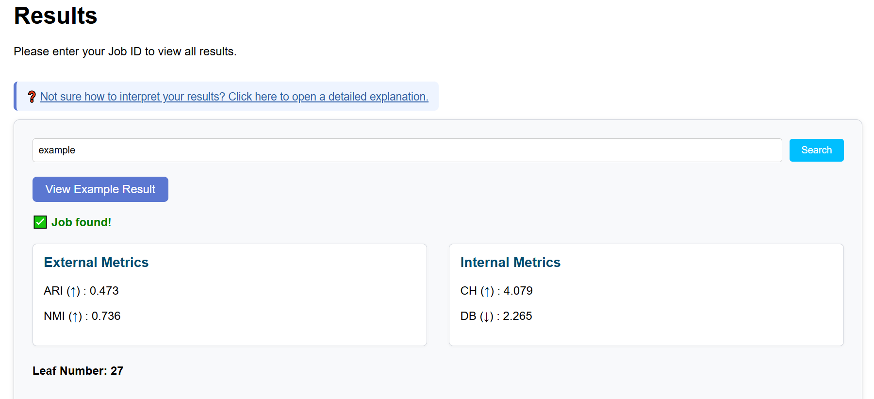
The interpretation of each metric is summarized as follows:
- ARI: ranges from 0 to 1; higher values indicate better agreement with ground-truth labels.
- NMI: ranges from 0 to 1; higher values indicate greater shared information.
- CH (log10): higher values suggest clearer cluster separation.
- DB: lower values indicate better cluster compactness and separation.
💡 Based on our empirical experience, setting both τ₁ and τ₂ to 0.1 generally yields stable and interpretable clustering results. For further optimization, we recommend adjusting τ₁ and τ₂ incrementally by 0.05 while monitoring changes in the evaluation metrics.
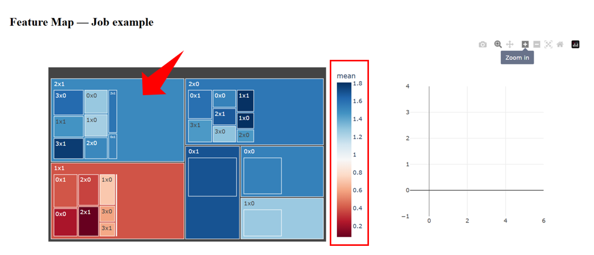
2. How to Interpret the Cluster Feature Map
scGHSOM reveals the hierarchical organization of single-cell data. Within a given cluster, the algorithm may further subdivide cells into multiple subclusters, forming a multi-level structure that can be explored recursively. This design reflects the intrinsic heterogeneity of single-cell populations: even cells belonging to the same broad group may exhibit substantial internal diversity.
2.1 Overview of the Cluster Feature Map
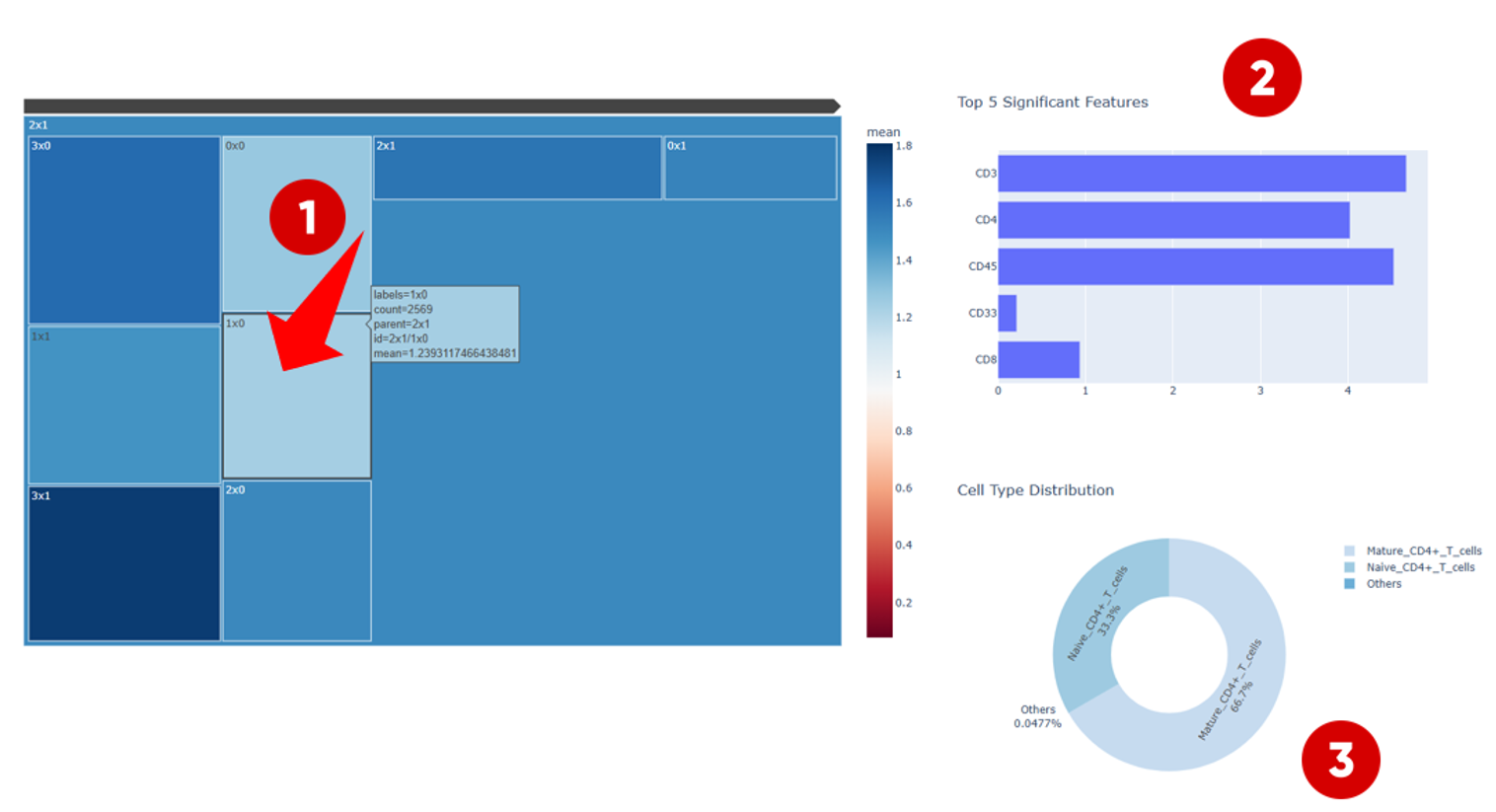
In the Cluster Feature Map, different clusters are displayed using distinct colors. The color intensity represents the average protein expression level of cells within each cluster.
If users are interested in clusters with relatively high protein expression levels (for example, the cluster located in the upper-left region), they can click on the cluster to explore its internal structure.
2.2 Detailed Interpretation of a Selected Cluster
After selecting a cluster, the Cluster Feature Map interface is divided into three main components:
- Left panel — displays differences in protein expression profiles among subclusters within the selected cluster, allowing users to compare expression patterns across subpopulations.
-
Upper-right panel —
shows the top five most significant protein markers that contribute
to the clustering outcome.
- When no ground-truth labels are available, these markers can be used to infer the potential cell identity of the cluster.
- When reference labels are provided, users can examine which protein markers are most informative for distinguishing cell populations, as well as whether their associations are positively or negatively correlated.
- Lower-right panel — if ground-truth cell-type annotations are available, this panel displays the proportion of different cell types within the selected cluster. This information helps identify which cell types tend to be grouped together during clustering, potentially reflecting shared biological characteristics.
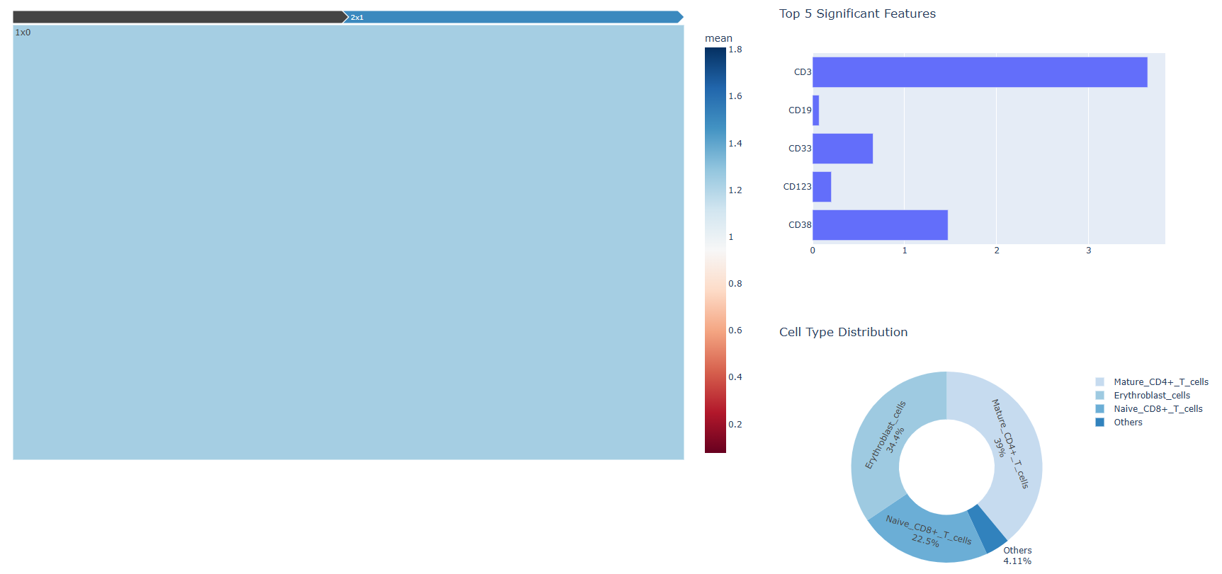
2.3 Cross-Level Comparison and Interpretation
After entering a specific subcluster, users can examine whether the set of significant protein markers changes across hierarchical levels, and whether the distribution of cell-type annotations varies accordingly.
By iteratively comparing clusters across different hierarchical levels, users can gain insights into how cellular populations are organized at multiple resolutions and how their biological characteristics evolve across scales.
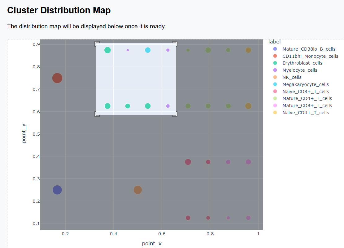
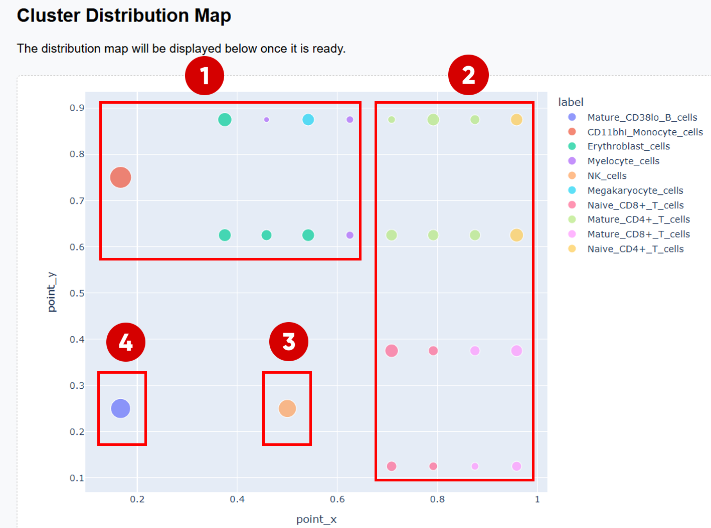
3. How to Interpret the Cluster Distribution Map
After scGHSOM clustering, each cluster is projected onto a two-dimensional plane using a mathematical embedding scheme (see the original publication for details). In the resulting distribution map, clusters that are positioned closer together are more closely related in the clustering process.
Therefore, the Cluster Distribution Map provides a global view of relationships among clusters and can be used to explore potential associations between different cell populations.
3.1 Example of Biological Structure Interpretation
- The upper-left region is primarily occupied by the myeloid–erythroid progenitor–derived cell family, including monocytes, myelocytes, megakaryocytes, and erythroblasts.
-
The right half of the map forms a clear
T cell family:
- The upper-right region is dominated by CD4+ T cells.
- The lower-right region is enriched for CD8+ T cells.
- NK cells form a distinct region that is clearly separated from other cell populations.
- Mature_CD38lo_B_cells are also well separated from other populations, highlighting the distinct lineage of B cells.
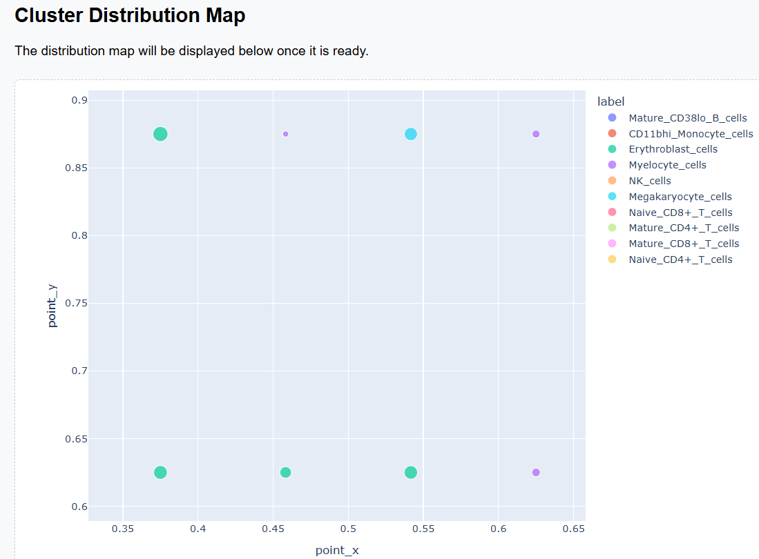
3.2 Interactive Exploration
Both the Cluster Distribution Map and the Cluster Feature Map support interactive exploration. When the number of clusters is large and visual distinctions become difficult to discern, users can employ the zoom-in function to focus on specific regions and examine cluster relationships in greater detail.